Once a month learn how to use scrapbook sketches and adapt them to fit different styles, photo sizes, and themes. Sketches = endless scrapbooking ideas with little effort. Sketches do all the heavy lifting allowing you to have all the fun!
With this layout I added more photos, a lot more, to the left page and used less photos on the right page.
Here's the sketch that I have used as the starting point for each layout this week:

You can also grab the Sketch Support #19 Bonus Sketch Examples!

This month it is a 3-page PDF of 22 different sketch options. That makes 23 sketches for this month of Sketch Support. There are options that show how to change up the papers, use more photos, use less photos, use only 4 x 6" photos, there are three one-page options, and then an 8-1/2 x 11" option. The fun part is that you could use each option as a layout on its own, but you could also mix and match different options for endless possibilities!

Supplies used - Cardstock: Bazzill; Patterned paper: PhotoPlay and Authentique; Wooden "love this moment" piece: Fancy Pants; Word stickers: Authentique; Wooden flowers: Pinkfresh Studio and unknown; Die cuts: Pinkfresh Studio; Word stickers: Simple Stories; Embroidery floss: DMC; Computer font: Century Gothic
Variation #1 - Using more photos (left page.)
I had tons, and I mean TONS, of photos of Jackson feeding the fish at Dogwood Canyon. The setting was so beautiful and he was having so much fun, I just couldn't stop taking pictures. I know I'm not the only one that gets photo happy in moments like this! I wanted to find a way to include as many photos as I could without overcrowding this layout design. My idea was to take that vertical background piece behind the 3 x 3" photos and make that the photo block instead. This gave me a lot more space for a lot more photos. That made that section go from 5 photos to 17 photos!

I used a combination of 2 x 2", 3 x 2", 3 x 3", and 4 x 3" photos to create this large photo block. A few of the photos are slightly smaller than that because I added some photo mats here and there. Anytime I have a large photo block with photos that are all very similar, I like to throw in some photo mats to help the photos stand out and break up the repetitive setting so each individual photo is noticed.
Variation #2 - Using less photos (right page.)
One of the very first ideas I had for this sketch was using a large, panoramic style of photo in place of the three 3 x 5" photos on the right page. I love the look of panoramic photos, especially ones of beautiful scenery. I knew that this set of photos would be perfect for that style of photo.

I cropped my photo to 9 x 5" so it covers the exact same space as the 3 x 5" photos do so I didn't have to make any changes in order for it to fit.
Variation #3 - Replacing strips with a shape.
I replaced strips with shapes twice on this layout.
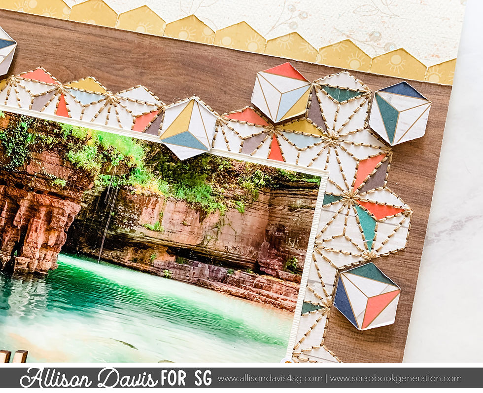
The first one is the most obvious. I swapped out the vertical banner strips for a hexagon design. I was immediately drawn to this hexagon patterned paper from PhotoPlay and thought it would make a great background for this photo.

I wanted to follow along the hexagon pattern instead of cutting it into a straight edged mat. To do this I placed my photo on the hexagon paper and then used a pencil to trace along the pattern so I would know where to cut to make sure I liked the framing of the hexagons.

To complete the design I added hand stitching along every line in the pattern. This took FOREVER! Way longer than I anticipated! After that was done, I cut a few individual hexagons and adhered them around the design with foam adhesive to add some dimension to the whole look.

The second strip replacement was with the striped strips. I used a hexagon punch to cut out several hexagons and then I cut them in half to create a border. I liked that it fit with the hexagon background piece and gave a slightly different look to that edge.

Variation #4 - Changing elements to fit the theme and the design adaptations.
I did use flowers, like the sketch, but not as many as you see on the sketch. With so many photos and the hexagon detail I didn't feel like it needed too much more. Plus, I had to make some adjustments since the photo block was enlarged.

Instead of placing one cluster on the top right edge of the photo block on the left page, I decided to including it in my photo block. It's actually placed on top of a few photos, in the empty space.

That's all for day 4! Check back tomorrow for the last day and then on Monday we have the YouTube version!
Want to see more? Find me on...

Comments