Once a month learn how to use scrapbook sketches and adapt them to fit different styles, photo sizes, and themes. Sketches = endless scrapbooking ideas with little effort. Sketches do all the heavy lifting allowing you to have all the fun!
For my day three layout I made lots of big changes, but I think you can still see the design of the sketch there. It looks so different, but you can look at the sketch and look at the layout and clearly see where the sketch inspired the design even with all those changes.
Here is the sketch that I have used as the starting point for each layout this week:

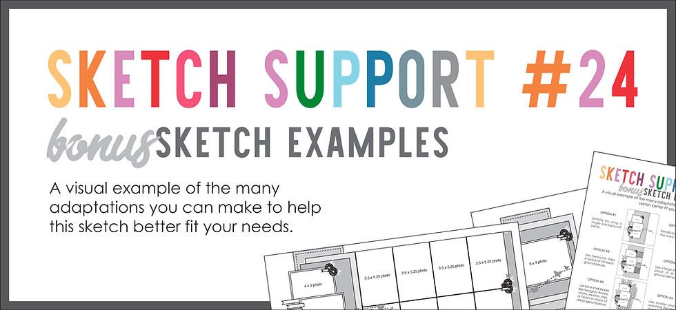
You can also grab the Sketch Support #24 Bonus Sketch Examples!

This month it is a 3-page PDF of 23 different sketch options. That makes 24 sketches for this month of Sketch Support. There are options that show how to change up the papers, use more photos, use less photos, use only 4 x 6" photos, there are four two-page options, and then an 8-1/2 x 11" option. The fun part is that you could use each option as a layout on its own, but you could also mix and match different options for endless possibilities!

Supplies used - Patterned paper, die cuts, foam elements, stickers, and enamel dots: Simple Stories "Full Bloom"; Hexagon punches: Fiskars; Nuvo Drops: Tonic Studios; Embroidery floss: DMC
Variation #1 - Using one larger photo in place of the three smaller photos.
I only had one 4 x 6" photo for this layout, but this sketch is easy to adapt to more or less photos so that wasn't a big deal. Two of the 4 x 3" photos on the sketch are the same size as the 4 x 6" photo and then I let my larger title fill in for the third 4 x 3" photo.
You can always use more or less or larger or smaller with just a few adjustments here and there.
Variation #2 & #3 - Combining the three background pieces into one. | Using a grouping of small shapes to create the background.
Hexagons, without a doubt, will always be one of my absolute favorite shapes to scrapbook with. With this photo and the Simple Stories "Full Bloom" collection, hexagons felt like a good fit.

I used a larger hexagon punch for a floral patterned paper and then used a medium hexagon punch for an orange paper and layered them together. I wanted to keep it somewhat simple because I knew I was going to have a lot going on with the flowers. If I would have used several different patterns, I was running the risk of the hexagons and flowers kind of blurring together. I needed the background to be more simple.

Variation #4 - Using themed elements in place of the wavy line.
With design I wanted it to look like Drew was surrounded in Spring. I used the placement of the wavy line as my inspiration and arrangement my flowers to frame the photo.

I also add a larger title along the bottom of the photo.
To bring a lot of dimension, texture, and detail to those flowers I added some hand-stitching, enamel dots, and Nuvo Drops.

That's all for day 3! Tomorrow is the last layout of Sketch Support and then on Friday I'll post the video version of Sketch Support.
Want to see more? Find me on...

Comentários