Once a month learn how to use scrapbook sketches and adapt them to fit different styles, photo sizes, and themes. Sketches = endless scrapbooking ideas with little effort. Sketches do all the heavy lifting allowing you to have all the fun!
The last layout is always about showing how you can alter the sketch to work for a different size of layout. This month since the sketch is a one-page sketch, that means stretching the sketch to work on a two-page layout. There are many, many ways you can adapt a sketch to work with different sizes!
Here is the sketch that I have used as the starting point for each layout this week:

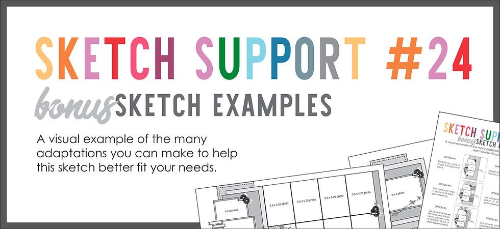
You can also grab the Sketch Support #24 Bonus Sketch Examples!

This month it is a 3-page PDF of 23 different sketch options. That makes 24 sketches for this month of Sketch Support. There are options that show how to change up the papers, use more photos, use less photos, use only 4 x 6" photos, there are four two-page options, and then an 8-1/2 x 11" option. The fun part is that you could use each option as a layout on its own, but you could also mix and match different options for endless possibilities!

Supplies used - Cardstock: Bazzill; Patterned paper and cut outs: "Pianoforte Plus" by Scrapbook Generation; Glitter paper: DCWV; Music notes cut file: Silhouette #2965; Heart punch: Fiskars; Sequins: unknown; Embroidery floss: DMC
It's not often that you get to make a layout about a person with papers that that person designed! My mom and her love for both piano playing and scrapbooking inspired her to create this paper collection, Pianoforte Plus. This is an exclusive collection to Scrapbook Generation and it is simply beautiful! It's perfect for not just piano but music in general and it includes papers for 12 other instruments. It's really a wonderful collection. The preorder for it ended earlier this week, but we will have at Scrapbook Generation soon.
For my two-page layout I used two of the main details from the one-page sketch mixed with my own design ideas.
On the right page you can see that I used the same photo arrangement as the one-page sketch, altered to fit my needs. The photos that I wanted to use in this area worked better as a square so I went with 3-1/2 x 3-1/2" for those and then arranged them almost exactly as you see on the sketch.

I also embellished around those photos in a way similar to the sketch. There's a little more there, but I stayed somewhat close to the same placements as the sketch.

I did move the title and it's quite a bit larger than the title on the sketch. That bottom photo has a lot of empty space so it gave me a lot more room to overlap onto the photo and arrange my title there.

The other detail I used from the sketch was that wavy line. I used that as a large focus of my layout. Instead of just using the one wavy line, I used several grouped together to create a large wavy background across the whole layout.
The piano keys across the bottom are part of a patterned paper that has this arrangement of piano keys in a wavy line. How perfect is that for this sketch!? I cut along the wavy line and then used that cut as my template for the other patterned papers.
To go with my music theme I swapped out those butterflies on the sketch for glittery music notes and sequins.


With my journaling it felt like no matter how I put it into words, it just never seemed to accurately paint the picture of what it was like to wake up each Sunday to my mom playing the piano. So I decided to take advantage of technology and go a step further than just telling the story and made it so that you can actually hear what I did in my childhood days. To do that I created a QR code that you can scan with you phone and it will take you to a 13 minute video of my mom playing various songs on the piano.

I pulled the audio from several videos she had posted on Facebook and put it all together in one video. Listening to it takes me right back to those early Sunday mornings of my childhood!
If you want to see the video you can either scan the code with your phone or you can view it below.
Here's how I made the QR code:
1. I uploaded the video to YouTube and set it as unlisted so you can only access it via the QR code or a direct link.
2. Then I went to QR Code Monkey, which is a website that has a free QR code generator.
3. I added the URL to the appropriate box and it generated the QR code that I could then download.
4. After I download the QR code I uploaded it to Photoshop to crop it down to the size I needed for my layout.
5. Then I printed it on photo paper and adhered it to my layout.
It was really quite easy!
That's all for the layouts of Sketch Support, but it's not over yet! Tomorrow I'll share the YouTube video version of Sketch Support where I'll talk through all of the ways I adapted and customized the sketch.
Want to see more? Find me on...

Comments