Once a month learn how to use scrapbook sketches and adapt them to fit different styles, photo sizes, and themes. Sketches = endless scrapbooking ideas with little effort. Sketches do all the heavy lifting allowing you to have all the fun!
The day three is a good example of taking the concept of the design and adapting and customizing it to fit your photos and theme.
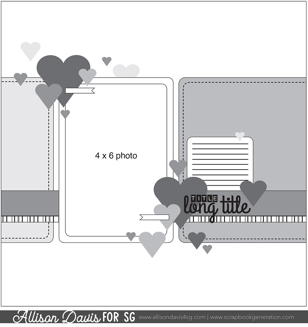
Here is the sketch that I have used as the starting point for each layout this week:

You can also grab the Sketch Support #26 Bonus Sketch Examples!

This month it is a 3-page PDF of 23 different sketch options. That makes 24 sketches for this month of Sketch Support. There are options that show how to change up the papers, use more photos, use less photos, there are four two-page options, and then an 8-1/2 x 11" option. The fun part is that you could use each option as a layout on its own, but you could also mix and match different options for endless possibilities!

Supplies used - Cardstock: American Crafts; Patterned paper, stickers, puffy stickers, flower die cuts: Paige Evans "Splendid"; Nuvo Dream Drops: Tonic Studios; Jewels: Honey Bee Stamps; Chipboard frame: Simple Stories; Embroidery floss: DMC; Computer Font: Golden Rule Sketch
Variation #1 & 2 - Adding more photos. | Repeating the sketch design.
For this layout I started with five 2 x 2" photos. One idea I had was to group them together, along with another 2 x 2" square, and create a 4 x 6" photo block. This way I could have used the sketch exactly as it was. But, after I picked out my paper and embellishments I had a different idea pop in my head so instead I decided to shrink the design concept down and repeat it creating a strip that leads to a photo x 4. (I think this would also look great with 3 x 3" photos and 3" strips.)
I chose not to use the fifth photo in this arrangement because I liked the look better with just the four photos and strips. I feel like with the busier cluster design, there needed so be some white space.
I also decided to highlight one of my favorite photos with a chipboard frame.
Variation #3 - Replacing the left side papers with a large cluster design.

The whole idea for this layout was inspired by an embellishment package of flowers from the Paige Evans Splendid collection. At first I had thought that I could follow the sketch with the left side pieces as well and then add some floral clusters on the corners, like you see on the sketch. BUT, once I started arranging those flowers, I just couldn't shake the idea of how cool this would look with a giant cluster stepping in for those paper pieces.

The fun part of this design is that you could easily create a cluster like this to go with many different themes.

Variation #4 - Adding a photo by the journaling and title.
I still had that fifth photo to use so I added it next to my title and journaling.
A fun little feature to this layout is that the journaling and title go together. If you read the journaling the title in the middle is actually part of the story.

That's all for day #3! Be sure to come back tomorrow to see the last layout!
Want to see more? Find me on...

Comments