Once a month learn how to use scrapbook sketches and adapt them to fit different styles, photo sizes, and themes. Sketches = endless scrapbooking ideas with little effort. Sketches do all the heavy lifting allowing you to have all the fun!
Here is the sketch that I have used as the starting point for each layout this week:

You can also grab the Sketch Support #31 Bonus Sketch Examples!
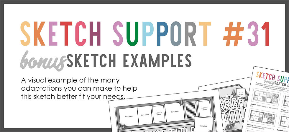
This month it is a 3-page PDF of 22 different sketch options. That makes 23 sketches for this month of Sketch Support. There are options that show how to change up the papers, use more photos, use less photos, there are four two-page options, and then an 8-1/2 x 11" option. The fun part is that you could use each option as a layout on its own, but you could also mix and match different options for endless possibilities!
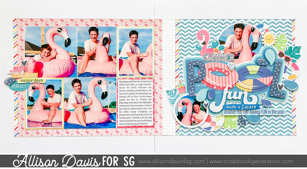
Supplies used - Cardstock: American Crafts; Patterned papers: Echo Park and Simple Stories; "Pool Fun" cut file: Silhouette Design Store #299290; Stickers: Simple Stories and Bella Blvd.; Die cuts: Bella Blvd; Embroidery floss: DMC; Computer font: American Typewriter
Variation #1 - Adapting the large title to fit my theme.
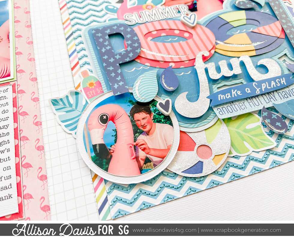
I knew that I wanted to create a water themed layout with this sketch and I've been wanting to use this super cute "Pool Fun" cut file forever! It felt like the sketch and that cut file could be a perfect match!

The title piece doesn't take up as much room as the title on the sketch so I added a lot more detail around it. I used leaves, beach balls, and lots of fun summer-y themed details.
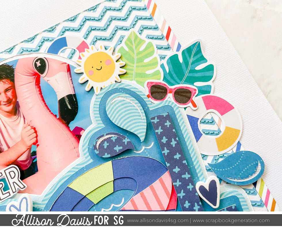
Originally I had wanted to use wave strips to make the background behind the title, but when I was going through and picking out my papers to use I really like how the blue chevron paper almost looks like waves. I decided to use it instead and add some stitching along the blue lines for added texture and dimension.
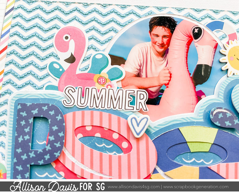
Variation #2 - Using shaped photos on the right page and changing the arrangement.
When I was in the planning stages of this layout I thought it would be fun to have lots of beach balls and cut my photos into circles to match. I'm so glad that thought came to my brain because I love the look of circle photos with this sketch!
For the rest of the layout I followed the sketch exactly.
That's all for today! Be sure to come back tomorrow to see the third layout using this sketch!
If you enjoy using sketches and want to learn how to adapt and customize them, I have a new guide called Creating With Sketches. It's goes in depth of how I breakdown a sketch design and adapt to work with my needs. It covers everything you need to know about making sketches work for you.

Shop all sketches here: Allison Davis Sketches
Want to see more? Find me on...

Don't have a Silhoutte -- but would die to have that cut file!! Any chance that might be for sale??