Sketch Support #34 | Learn How to Use and Adapt Scrapbook Sketches | Day 2
- Allison
- Nov 29, 2023
- 2 min read
Once a month learn how to use scrapbook sketches and adapt them to fit different styles, photo sizes, and themes. Sketches = endless scrapbooking ideas with little effort. Sketches do all the heavy lifting allowing you to have all the fun!
Another day of Sketch Support means another layout based on that same one-page sketch.
Here is the sketch that I have used as the starting point for each layout this week:

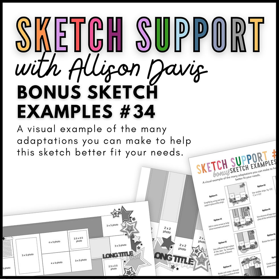
You can also grab the Sketch Support #34 Bonus Sketch Examples!

This month it is a 3-page PDF of 23 different sketch options. That makes 24 sketches for this month of Sketch Support. There are options that show how to change up the papers, use more photos, use less photos, there are four two-page options, and then an 8-1/2 x 11" option. The fun part is that you could use each option as a layout on its own, but you could also mix and match different options for endless possibilities!

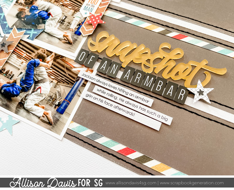
Supplies used - Cardstock: American Crafts; Patterned paper: Bella Blvd., Simple Stories, Echo Park, and My Mind's Eye; Acrylic "snapshot" title: Color Cast Designs; Alphabet stickers: Elle's Studio; Star punch: Fiskars; Stickers: Echo Park; Embroidery floss: DMC; Computer font: Century Gothic
This time I made several small changes to adapt the sketch design to work with a different photo size.
I opted to rotate the sketch so that the vertical strips became horizontal strips. I had three 3-1/2 x 2-1/2" photos and while it would have worked to use them without rotating the sketch, I really liked the idea of them being stacked in order of action from top to bottom. I felt like they worked better that way since they are horizontal photos. Had they been vertical photos (2-1/2 x 3-1/2") I would have arranged them as shown on the sketch. This falls into the category of sometimes I don't have a better answer other than, "I did it this way because I liked the way it looked!"

Another small change I made was to the strips, title, and journaling. I cut the strips slightly smaller than the photos so there is a little gap between each one. Since I used the same paper for each strip, this helped to break it up and show that each one is an individual strip.
I also added a striped strip on each one.

I moved the title and journaling onto the horizontal strips, grouped together near the photos to better work with the sketch rotation and my photos.
For the rest of the design I followed the sketch quite closely with lots of stars layered and clustered together along the edge of the photos.


If you enjoy sketches or want to learn more about adapting them, I've got a year-long class coming up for 2024 with Scrapbook & Cards Today magazine.

You can get all the information and sign up here: Sketches 2024
Shop all sketches here: Allison Davis Sketches
Want to see more? Find me on...


Comments