Once a month learn how to use scrapbook sketches and adapt them to fit different styles, photo sizes, and themes.
A new sketch, three new layouts...it's time for Sketch Week!
If you are new to Sketch Week here's how it goes. Over this week I will share one sketch and three different layout variations based on that same sketch. The point is to show you how versatile scrapbook sketches are and how you can adapt them to fit your needs.
Now on to the new, FREE sketch that is the inspiration for my layouts this week.

You can download the full sketch with measurements and placements by clicking here.

I stuck fairly close to the sketch with this layout while making a few adjustments to personalize it to my needs.
Variation #1 - Using a larger photo in place of two smaller photos.
I used one 5 x 3-1/2" photo in place of the two 2-1/2 x 3-1/2" photos on the right. Because my larger photo is the same added measurements of the two smaller photos, I didn't have to change a thing to make it work.
This is one of the easiest ways to customize a sketch to fit the photos you have. If you see a sketch that has more photos than you have, use one photo in place of two or even three (if they are really small photos like 2 x 2") on a sketch. Most of the time you can do this without having to change or adjust anything else to fit.
Variation #2 - Adding an embellishment or card in place of a photo.
Since I only had one photo for this layout I replaced the third 2-1/2 x 3-1/2" photo with a 3 x 4" card that I cut down to 2-1/2 x 3-1/2" to fit.
This is another easy way to adjust a sketch that has more photos than you have or if you don't like working with smaller photos. You can always replace them with cards, quotes, embellishments, more journaling, etc.
Variation #3 - Using smaller strips to replace larger strips.

Since the photo I used didn't have a lot of colors, I wanted to take advantage of all the beautiful fall colors and patterns by including more strips of papers. I end up using 1/2" strips instead of the 1" strips on the sketch so I could have double the color and patterns.
A little side note to explain the pairing of photos and colors a little more:
When it comes to pairing photos and patterns I generally follow a small "rule." I say "rule" because I don't really like using that word when it comes to creating. However, there are some "rules" that can help us create a more visual pleasing layout. So...my "rule" is:
If I have a photo that is really busy and full of colors, I would most likely choose a background that is a little more plain. If I have a photo that doesn't have a ton of different colors, I would most likely choose a background that has a little more going on both in color and patterns.
You want your photos and papers to compliment each other, not compete with each other.
Variation #4 - Replacing the floral embellishments with fall-themed clusters.

I had a little fun with this one!
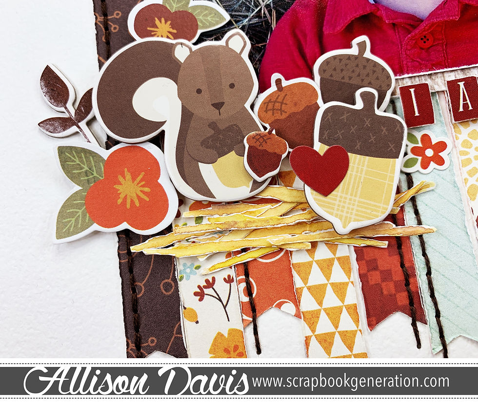
Keeping with my watercolor experimentation, I used watercolors to create small pieces of hay. My son is sitting in front of a large bale of hay and I could think of no better way to highlight that than to create some paper hay.
I chose three different colors to paint with: yellow, orange, and brown. I used both layering and blending of these colors to create the hay pieces.

I started with painting the yellow as the base. Then while the yellow was still wet I add in a small amount of orange and brown.
After the lines had dried I cut them out with my scissors and adhered them on my layout.
To finish the look of embellishments I layered together the hay pieces, flowers, a squirrel, acorns, word stickers, and some vine pieces.
There are two more layouts based on this sketch to see! Check them out!
If you enjoy this sketch be sure to check out all of the sketches we have to offer at scrapbookgeneration.com There are tons of sketches!!
Products used: Cardstock: Bazzill; Patterned papers: Echo Park; Embellishments: Echo Park and Simple Stories; Watercolors: Pinkfresh Studios; Embroidery floss: DMC; Computer font: Century Gothic

Love your adaptations! I'm always looking for new ideas and ways to use all those sketches I've found